

Binding is the FINAL step (yay!) in completing a quilt, giving it a neat, finished look. The icing on the cake, if you will – can you tell I’m hungry while I’m writing this?
A good icing doesn’t overpower the cake you’ve made – but rather should complement and enhance the yummy cake flavors. And add a little design flair, if you want it to! And all icing is delicious so…
So how do you pick the perfect binding to complement and enhance your quilt?

I often get asked by customers which binding they should use so if you’re struggling with that final step - here are my 3 best tips for you
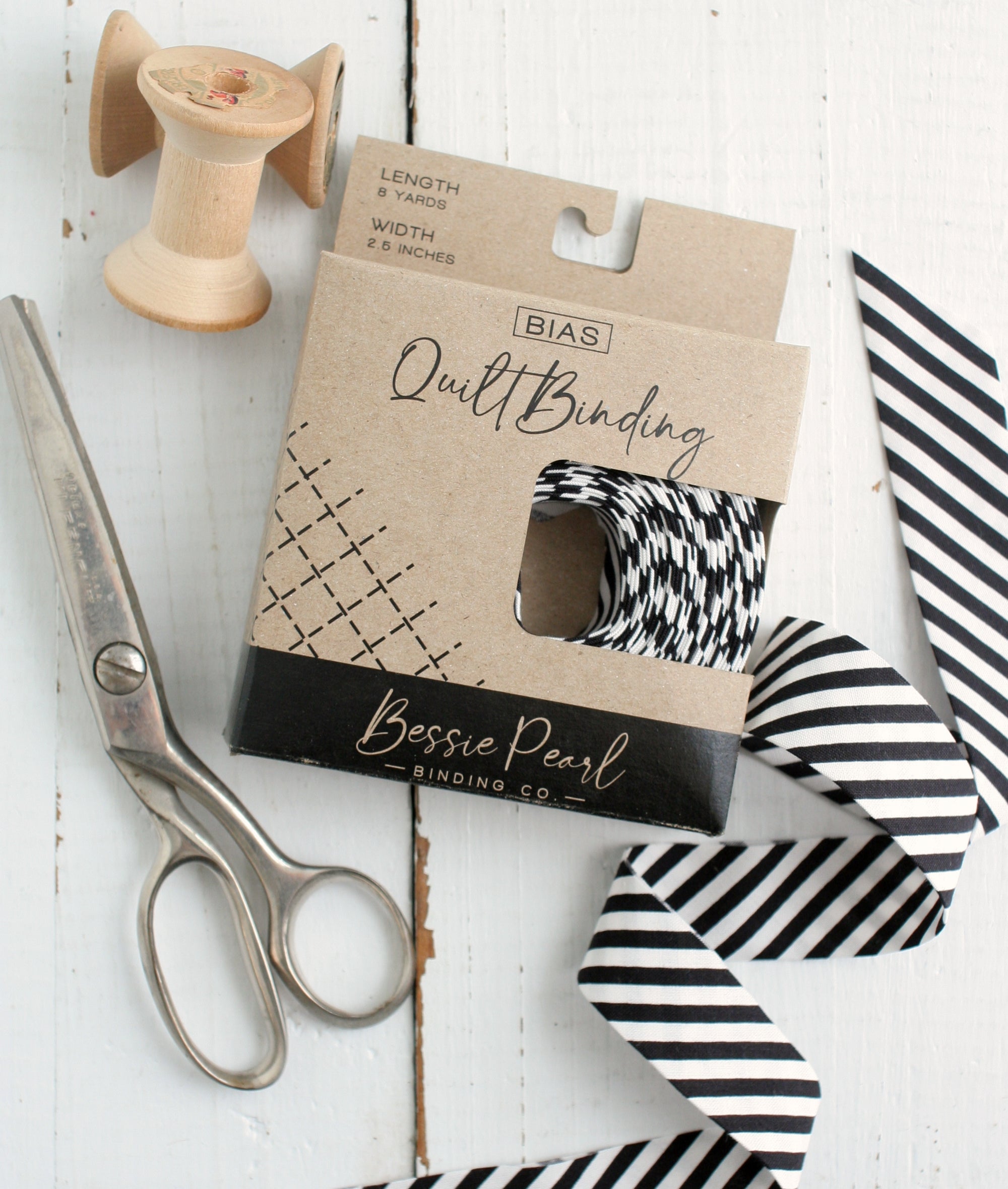
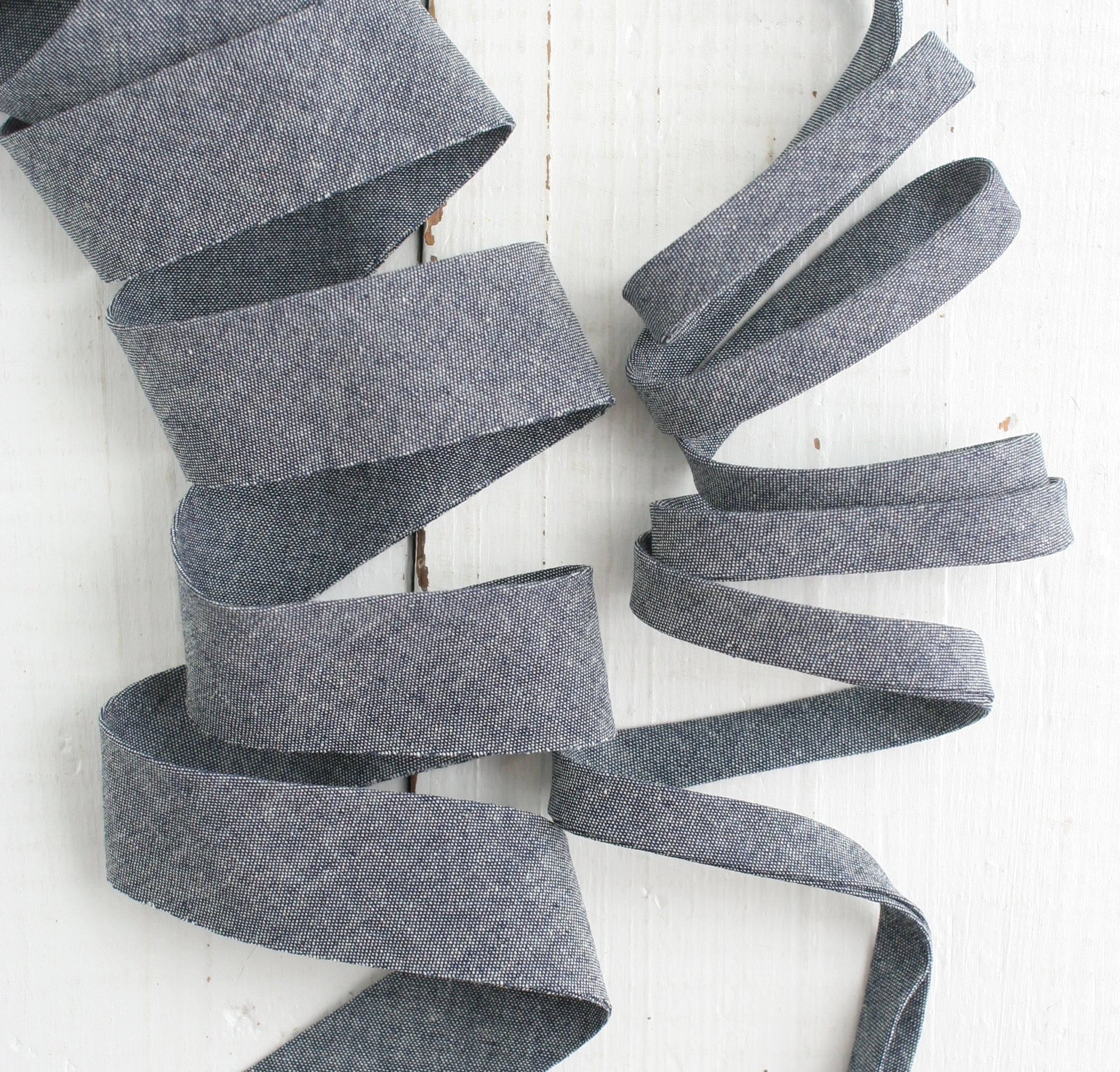
1. Print vs. Solid
Ask yourself – do you want a print or a solid binding?
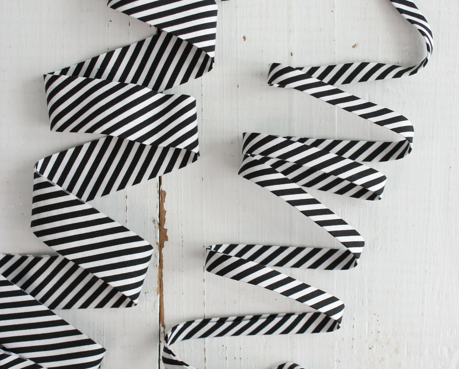
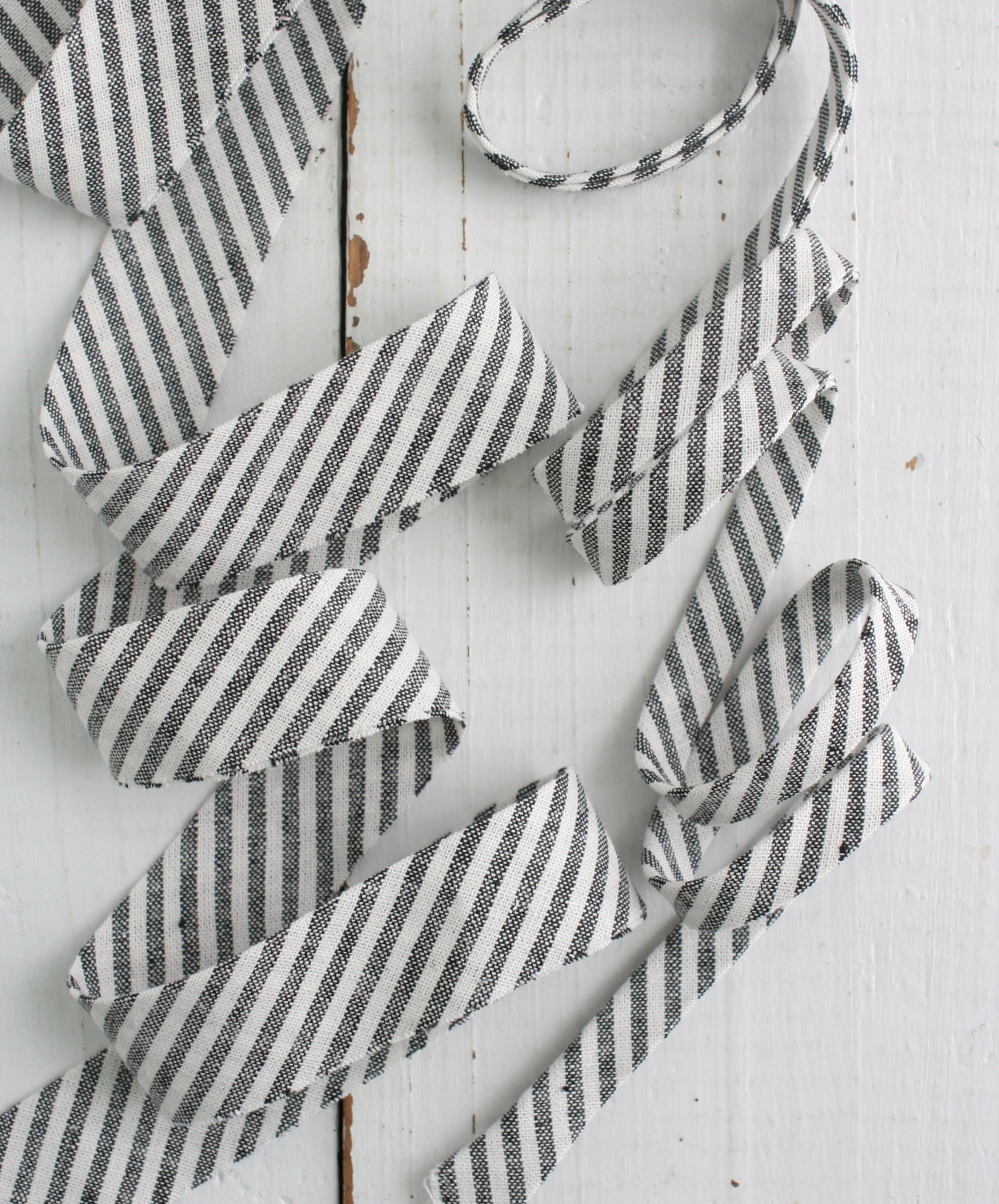
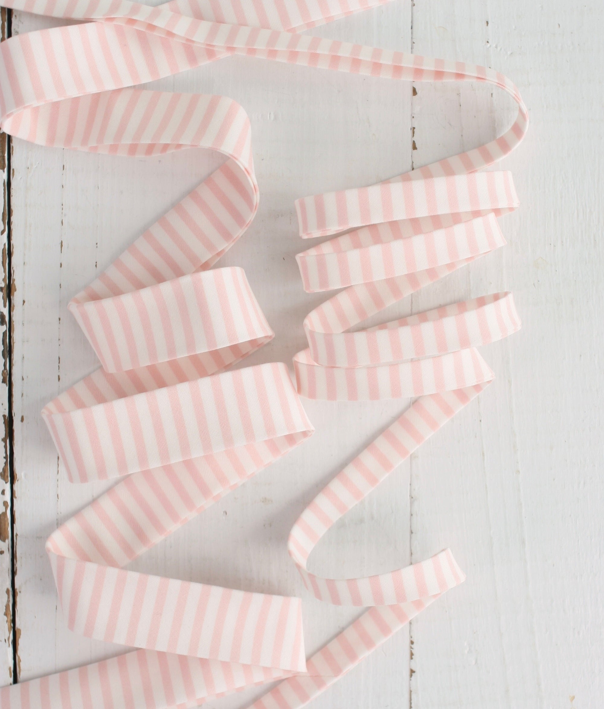
A print can be a fun, unexpected way to finish off your quilt with a punch of color and pattern. You can easily pull in one of the accent colors used in the quilt top. However, prints can sometimes overwhelm the overall design, especially on a quilt with a busy top pattern already.

I always suggest that if your quilt is busy and has lots of prints, then go solid for the binding to not overwhelm the eye.
Solid color bindings are a more classic choice. They allow the quilt top to be the main focus and allow the binding to blend in as more of a framing element. Solids are especially well-suited for quilts with intricate piecing that you don't want to distract from.

BONUS TIP – when using a print, make sure the scale is right! Your binding will only end up being about ½” wide so be sure to choose a small scale print so you can still see the pattern once the binding it finished. Ask me how I learned this, haha!
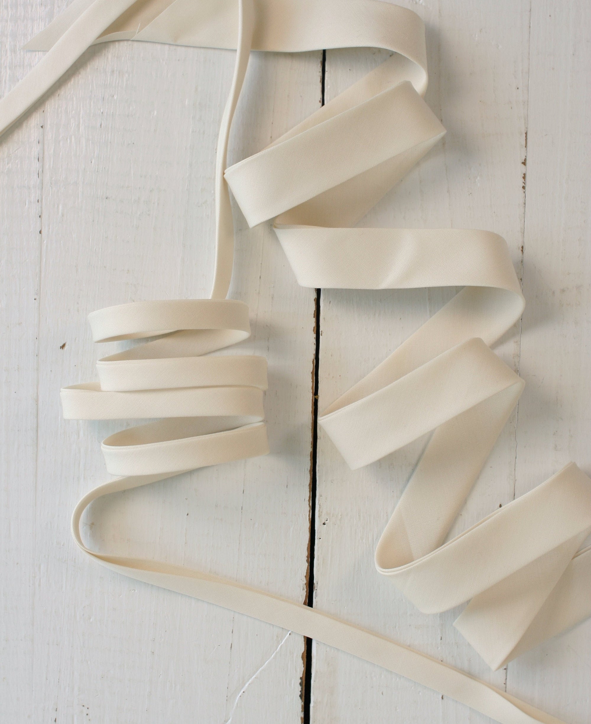
2. Light vs. Dark
Another decision is whether you want to go with a light or dark binding. In general, light bindings create a soft, gentle frame around the quilt, while dark bindings make for a higher contrast, more dramatic look. Lighter bindings blend in more with low-volume quilt tops with lots of white or cream fabrics. Darker bindings make the colors in a richly saturated quilt top pop.
Of course, rules are made to be broken! Sometimes adding an unexpected light binding to a vibrant, jewel-toned quilt top can create a stunning effect. Or using a dark binding on a light, airy quilt can give it a more modern edge.
Ask yourself – do you want the binding to blend in with the look of the quilt or be a fun pop of color and contrast on the outside? Both are good options! It’s all personal preference.

3. Don’t forget the Backing!
The first thing I ask someone who is looking for binding help is “what does the backing look like?” We often get so focused on the beauty of the front of the quilt that we forget about the backing. A good binding will complement both the front AND the back of the quilt – kind of like a good baker will frost the top and the sides of the cake to make a polished finished product.

If you’re having a hard time finding a binding color that matches the front and back – go NEUTRAL! Our bestselling bindings are all neutral colors that will easily go with lots different quilt colors and styles.
Whichever route you choose, the binding has a major effect on the overall look and feel of your finished quilt. I mean, what is cake without the icing?? It’s a muffin, that’s what it is.
Whatever you choose, make sure you love it and can live with it. That’s all that matters. And once you’re done, treat yourself to a piece of cake - you’ve earned it!
Ready to shop? Find all of our bindings here!


Leave a comment (all fields required)